The 7-part anatomy of opt-in pages that convert
From the Tech-Simplified Desk of Rucheli:
Welcome back to Systeme.io Sundays, my weekly tech love letter to all you coaches and course creators trying to simplify your online world!
I'm actually writing this while sitting on the floor between five overstuffed suitcases that I'm still last-minute packing, as I'm heading off to Alaska today! 🐻
For the next few weeks, these newsletters will be a bit shorter than usual while I'm adventuring in the Last Frontier. Don't worry though - I promise to include some breathtaking photos when I'm back so you can live vicariously through my glacier-viewing and hopefully-not-getting-eaten-by-bears experiences!
Even with packing craziness, I couldn't miss our Sunday tech date, so let's dive in!
🚀 Tech Truth Bomb: The Anatomy of a High-Converting Opt-in Page in Systeme.io
Last night, as I was frantically trying to find the rest of the things I still needed to pack (do you have any idea how hard it is to pack a family of 6 for a 15-day trip?!), I found myself thinking about opt-in pages.
Yes, really. This is the kind of wild and exciting life I lead, folks. 😂
After implementing hundreds of opt-in pages during my 10+ years as a software engineer and 6+ years running my own online businesses, I've discovered there's a secret anatomy to pages that actually convert.
It's like the difference between a sad desk salad and a chef's masterpiece - same basic ingredients, wildly different results.
So what makes the difference? Let me break down the perfect anatomy of a high-converting opt-in page in Systeme.io:
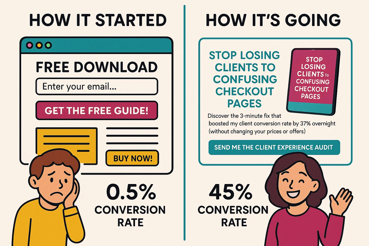
1. The Headline That Stops Scrolling
Your headline needs to act like a digital "wait, what?!" moment. It should speak directly to your ideal client's biggest pain point or most desired outcome.
In Systeme.io, this means using the H1 text element and keeping it to 10-15 words max. Position it front and center, above the fold.
Example: "Stop Losing Clients to Confusing Checkout Pages" vs. "Sign Up For My Newsletter"
2. The Subheadline That Seals the Deal
This is where you expand slightly on your headline, adding context and urgency. Think of it as the supporting actor that makes the star shine even brighter.
In Systeme.io, use the paragraph element with slightly larger font, positioned directly below your headline.
Example: "Discover the 3-minute fix that boosted my client conversion rate by 37% overnight (without changing your prices or offers)"
3. The "I See You" Bullet Points
These are 3-5 bullet points that make your visitor feel completely understood. Each bullet should start with "You're tired of..." or "You want..." statements that make them nod along.
Systeme.io tip: Use the bullet point element, but customize the bullet icons to match your brand (a little-known feature hiding in the element settings!).
4. The Irresistible Opt-in Offer
This isn't just any lead magnet - it's the perfect solution to the exact problem you just highlighted. The key is specificity and speed - what specific result can they get, and how quickly?
In Systeme.io, use an image element to show a mockup of your freebie alongside your form. We have mockup templates for those of you who are in Design Build Scale!
Example: "The 5-Minute Client Experience Audit: Score your current client journey and identify the exact spots losing you money"
5. The Friction-Free Form
The fewer fields, the higher the conversion rate. In most cases, first name and email is all you need. (And even first name is debatable 😉)
Systeme.io secret: Like we've spoken about in the past, you can A/B test your conversion rates between a button that leads to a pop-up (higher intent) vs an "inline" form (high conversion #s) to see which of those actually lead to more sales or discovery calls in the end.
6. The Action-Oriented Button
Your button text should be specific and action-oriented - never just "Submit" or "Subscribe."
In Systeme.io, customize your button text and color (make it stand out from the rest of your page - contrast is key!).
Example: "Send Me the Client Experience Audit" vs. "Subscribe"
7. The Trust-Building Footer
A small testimonial, credibility marker, or privacy reassurance at the bottom can boost conversions by addressing last-minute hesitation.
Example: "Join 1,247 coaches who've simplified their tech with our resources"
The beauty of Systeme.io is that all these elements are drag-and-drop simple. No coding required, no design skills needed. Just understanding the psychology behind what makes people click "yes" to your offer... and if you're a Design Build Scale member, we've done this work for you with our completely plug-and-play opt-in templates! Comment down below if you're not sure where to find them and my team will be sure to hook you up with the link ;)
🧠 Tech Simplification Challenge
This week, I want you to audit one of your existing opt-in pages using the 7-point anatomy checklist above.
If you don't have an opt-in page yet, even better! Open up Systeme.io and create a new page using one of their templates, or use the already done-for-you ones we've got in Design Build Scale, and then modify it according to these principles.
Next week, we'll be kicking off our "Email Marketing Deep Dive" series where we'll cover:
• Week 1: Email automation secrets in Systeme.io
• Week 2: Behind the scenes: My email marketing numbers revealed
• Week 3: Subject line formulas that get opens
• Week 4: Creating your first email sequence (step-by-step)
What's your biggest struggle with email marketing right now? Please comment below and let me know – I might feature your question in our upcoming deep dive!
Want Systeme.io Sundays in your inbox each week?
Just enter your email below and you'll be the first to know about new Systeme.io features that every coach and course creator should be using, plus lots of other goodies!

HEY, I’M RUCHELI…
... founder of Get The Tech Out Of Here, creator of the Design Build Scale tech implementation program and the Simple Systems Society tech support membership... and now I'm your personal guide on the tech journey that comes with launching an online business as a coach or course creator!
Can't wait to help you get the tech out of your business so you can get back to what you do best!